When choosing your colour scheme there are a few things to be aware of, firstly try and match the colour to your personalities, certain people are naturally "pink" people you will know at least one of these people, quite happy to be seen wearing bright pinks, usually feminate and outgoing.
This is not to say I don't like pink it just gets you in the mind set, if you think about your friends and family, think of their homes and the accessories and wall coverings you see in their homes you could probably pick the perfect wedding colour for them just from their tastes and tollerence levels.
Often people may buck this trend and suprise you with a colour scheme that nobody was expecting, however most of the time you will hear the phrase "it's a very them/her colour" this indicates that the chosen colour matches the style and personality expected.
The second thing to be aware of is colours are subjective, unfortunatley our eyes are all different and colours are seen differently by many different people depending on the light conditions and material the colour is being applied to, I often get reminded of a conversation about suits, a brown or grey suit, i can't remember what colour it was supposed to be but 3 people all had differing opinions on the colour and when it was viewed in natural day light this became even worse.
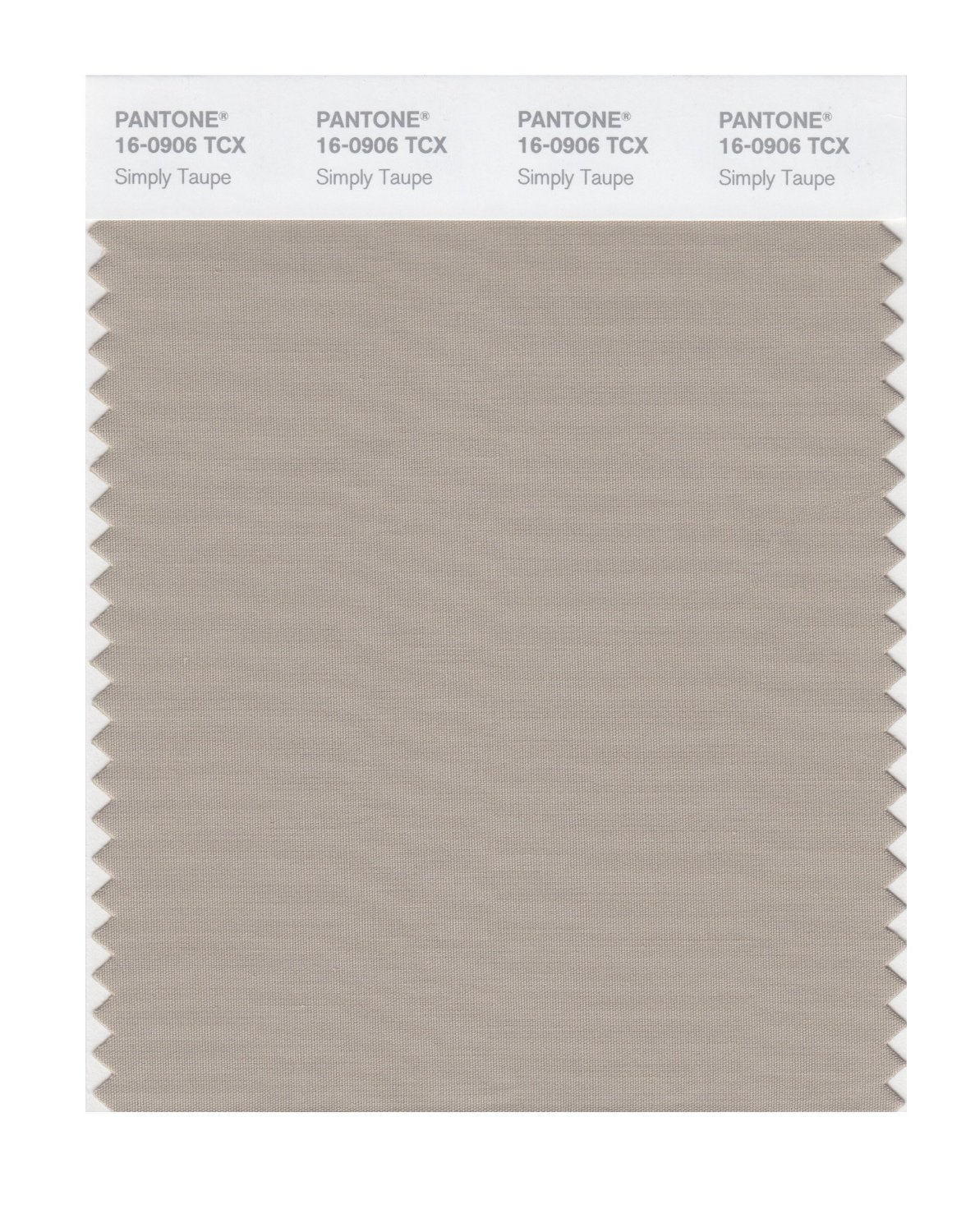
The only real consistent guide to colour is Pantone Chart, these colours act as a universal reference for colour and can be used to comunicate colour shades when you choose a non standard colour.
As you have probably guessed by now we have chosen a non-standard colour, neither of us are "pink" people and having attended a few weddings in the last few years we have seen an array of colours however agreed that none of them where really "us"
Our home is neutrally decorated with hints of colour in a couple of rooms however mainly neutral earth tones, this has definatley influenced the decision of our colour.
When describing our colour we have come to use the word "Taupe" this is then followed up by "a mushroomy latte type colour" as nobody understands the word taupe !
The closest colour is Pantone Smart 16-0906X
However we have variations of this colour keeping the same tone and having various degrees of shade. When we ordered our Save the date magnets (i'll come to that later) we had to upload a digital image which was then printed on a white magnetic surface, as you can imagine this developed a varying shade of our original colour and was not exaclty what we had envisaged, however we decided to keep them anyway and have now sent most of them out.
In summary dont be put off by being a little daring, don't pick a colour you don't like and certainly don't get drawn in by the "wedding colours" if they really do not suit your personality.
Our wedding colour is perfect and i think everything will look awesome on the day, and that's the most important thing, that we like it and we like the look on the day.


No comments:
Post a Comment